Contractor Website Redesign: Signs Your Current Site Is Hurting Trust and Conversions
A contractor’s website does not need to win design awards. It needs to make a homeowner feel confident enough to call, fill out a form, or request an estimate. That sounds simple, but plenty of contractor sites miss the mark in ways that quietly cost real jobs.
I have seen the pattern over and over. A business invests in trucks, wraps, tools, uniforms, photography, even paid ads, then sends traffic to a site that feels neglected or confusing. The owner often says the same thing: “We already have a website.” Technically, yes. Functionally, maybe not.
A weak site hurts in two places at once. First, it chips away at trust. Second, it interrupts conversion. Those are not abstract marketing terms. Trust is the gut feeling that your company is legitimate, capable, and responsive. Conversion is the moment a visitor actually takes the next step you care about, whether that means calling, submitting a form, or reaching a thank-you page after a request.
If your current site is underperforming, a contractor website redesign may be less about appearance and more about fixing the leaks in your sales process.
The first problem is usually not traffic
Many contractors assume the website is failing because not enough people are finding it. Sometimes that is true. Often, though, the bigger issue is what happens after visitors arrive.
A homeowner clicks through from Google, from a Local Services ad, from a referral text, or from a yard sign search. They land on your site and start judging fast. Can they tell what you do? Can they find your phone number without hunting? Does the site work on their phone? Does it feel current? Can they get to the exact service they need without friction?
When those basics fail, more traffic just means more wasted opportunity.
That is why a redesign should be judged by business outcomes, not by whether the new homepage looks modern. A website for a home service company has one job: support customer tasks and move qualified prospects toward contact. If it does not do that, the problem is structural.
What “hurting trust” actually looks like
Trust rarely disappears in one dramatic moment. It erodes through small signals.
An outdated site is one of the most common examples. Maybe the service area is wrong. Maybe an old phone number is still floating around on a page. Maybe the company says it offers a service line it no longer wants. Even old announcements or stale pricing references can create doubt. Homeowners may not consciously say, “This website is outdated, so I do not trust them.” They simply hesitate, then leave.
visit the siteThat hesitation matters more in contracting than many owners realize. Homeowners are not buying a T-shirt. They are inviting a company to work on their property, often spending meaningful money, and hoping the crew shows up when promised. If the website feels neglected, they may infer the business itself is disorganized.
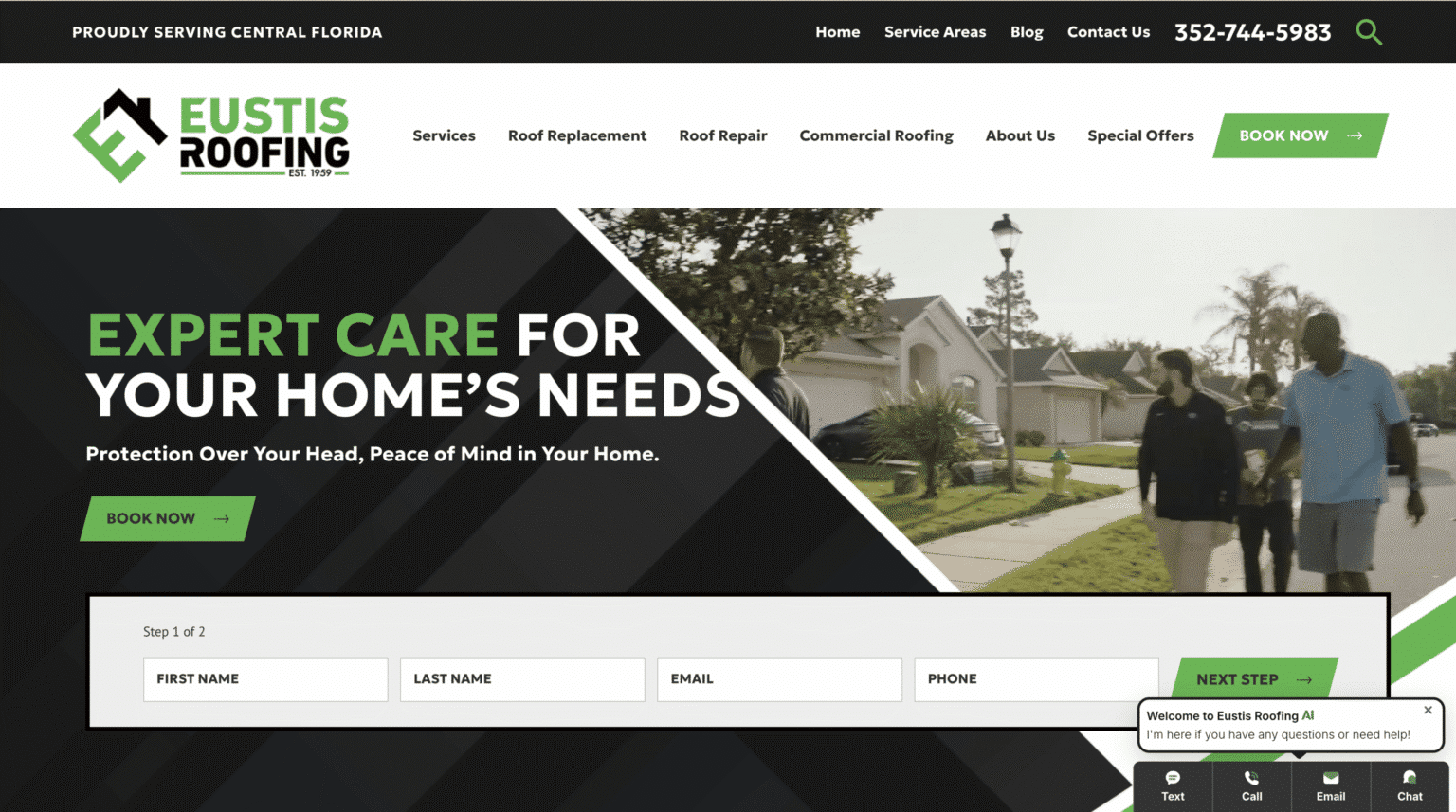
The same issue shows up across niche trades. A pool screen enclosure website design needs to feel clear and current because customers are comparing craftsmanship and reliability. A mold remediation website design has even less room for ambiguity because urgency and professionalism matter immediately. A dock builder website design has to reassure visitors that the company understands site-specific projects and can be reached easily. Different trade, same trust equation.
Your mobile experience may be the biggest hidden conversion killer
Most contractors still underestimate how many prospects first meet them on a phone. If your site looks fine on a desktop in the office but breaks down on mobile, you are creating friction right where it matters most.
This is not always dramatic. Sometimes the text is just too small. Sometimes the buttons are cramped. Sometimes images push the contact form so far down the page that users never reach it. Sometimes the navigation turns into a maze. Any one of those issues can be enough to lose a lead.
Google has been clear for years that mobile usability matters, and contractors feel that reality every day. A homeowner standing in a kitchen, driveway, or backyard is not sitting down for a leisurely website tour. They want quick reassurance and a fast way to reach you.
A contractor website redesign is often justified the moment you realize your site was built around how you browse, not how customers browse.
If people cannot contact you instantly, you are making them work too hard
The most common website mistake I see is buried contact information. It is astonishing how many contractor sites make visitors search for a phone number, scroll for a form, or click through multiple pages just to ask a question.
That is lost revenue disguised as poor layout.
Contact details should be easy to find. Not eventually. Immediately. If a homeowner has decided they want to talk, the website should not slow them down. This sounds obvious, yet it breaks down all the time when sites are built to impress instead of convert.
This matters whether you specialize in home remodeling website design, flooring contractor website design, epoxy flooring website design, or concrete coating website design. The customer journey may vary slightly by project type, but the expectation is the same: clear path, low friction, fast contact.
When owners ask why leads feel inconsistent, I often tell them to start there. Not with fonts. Not with animations. Just contact visibility. A surprising number of redesigns earn their keep by fixing that one practical issue.
Five signs your site is doing real damage
- Your phone number, service area, or core service details are outdated or inconsistent.
- The site is frustrating on mobile, especially navigation, button size, or form usability.
- Contact information is not prominent on every key page.
- Visitors have to guess what you do, where you work, or how to take the next step.
- The site feels old enough that a homeowner may question whether the business is active.
None of these problems are cosmetic. Each one can weaken trust or interrupt conversion.
A pretty site can still be a bad sales tool
This is where many redesign projects go sideways. The owner knows the site feels old, so they hire someone to “make it nicer.” The result may look cleaner, but it still does not perform.
Design matters, but not in isolation. A contractor website redesign should improve clarity before it improves style. The best sites answer customer questions quickly, direct attention toward contact actions, and remove uncertainty. If the redesign prioritizes visual flair over business logic, you can spend money and still end up with the same lead problem.
I have seen this especially in visual trades where galleries dominate the site. Photo work is important, certainly. A flooring contractor website design or epoxy flooring website design should showcase results. But galleries cannot do all the heavy lifting. If visitors admire photos yet cannot easily understand your process, service area, or how to request a quote, the website has become a brochure instead of a conversion tool.

The same is true in broader home remodeling website design. Beautiful project imagery can create desire, but trust is built through clarity, organization, and confidence that the company is reachable and current.
Outdated content does more harm than many contractors think
A neglected site sends subtle warnings.
Maybe the homepage still mentions a promotion from last year. Maybe there is a services page for an offering you dropped months ago. Maybe your team page references staff who no longer work there. None of that sounds catastrophic, but customers notice inconsistency, even when they cannot articulate it.
Google’s guidance to businesses has long emphasized keeping content current. That recommendation is not about pleasing an algorithm alone. It reflects user behavior. People trust businesses that appear active, accurate, and attentive.
For contractors, this is where maintenance becomes part of the conversation. It is not enough to launch a site and walk away for two years. If your business evolves, your website has to keep up.
That is one reason some owners move toward a managed website for small business rather than a one-time build they have to maintain themselves. Managed options commonly bundle hosting, security, backups, updates, and support. For a busy contractor, that can be more practical than owning a site that slowly goes stale because nobody has time to touch it.
The wrong platform choice can create long-term friction
When owners start exploring a redesign, one of the first questions is usually, “What is the best website builder for contractors?” The honest answer is that there is no single universal winner, because the right choice depends on your needs, budget, and appetite for involvement.
A DIY builder can be a reasonable fit when your main goal is a credible web presence with clear service information and basic lead capture. That path is often the most budget-friendly. If you mainly need a clean site with contact information, current content, and mobile usability, a simpler build can be enough.
But trade-offs matter. DIY tools save upfront cost, yet they also require your time, judgment, and ongoing upkeep. A platform is only as effective as the person managing it. Many contractors start with good intentions, then let updates slide once the busy season hits.
A freelancer or a web designer for contractors may be the right middle ground when you want more polish, better setup, and some custom direction without hiring a larger firm. An agency tends to make more sense when you need broader strategy, custom development, or more complex functionality.
Then there is the subscription route. A managed website for small business can shift the burden away from the owner by combining design, hosting, security, updates, and support into one ongoing service. For some contractors, that is a better business decision than trying to cobble together design, hosting, edits, backups, and troubleshooting from separate vendors.
What a redesign should fix first
A smart redesign starts with customer behavior, not internal preferences. Ask the blunt questions.
When someone lands on your homepage, can they identify your service in seconds? Can they tell whether you work in their area? Can they reach you without scrolling forever? On a phone, can they navigate the site with one hand? If they are comparing you to two competitors, does your site reduce doubt or create it?
These are practical conversion questions. They matter more than whether you prefer a dark header or a light one.
The best redesigns usually simplify. They remove clutter, update essential business information, sharpen service messaging, and make contact paths obvious. They are less about adding things and more about clearing obstructions.
For niche trades, that discipline matters even more. A concrete coating website design should not bury the service beneath generic contractor language. A pool screen enclosure website design should not force visitors to guess whether repairs, replacements, or new enclosures are offered. A mold remediation website design should not make urgent visitors dig for the phone number. Precision builds trust.
Cost matters, but the cheapest option can get expensive later
Sooner or later, every redesign conversation reaches the same question: how much does a contractor website cost?
There is no fixed answer. Cost varies widely based on design needs, functionality, who builds it, and what ongoing maintenance is included. That variability is normal. The lowest-cost route is usually a DIY builder. Freelancer and agency projects typically move more of the expense into project fees, which can start in the low thousands and climb much higher depending on complexity. Managed subscription models spread cost over time and often include support services that would otherwise be separate expenses.
The better question is not just “How much does a contractor website cost?” It is “What am I actually buying?”
If you pay less upfront but end up with a site that nobody updates, that breaks on mobile, or that makes leads harder to capture, the bargain evaporates. If you spend more on strategy and support and the site finally helps convert the traffic you already have, that may be the cheaper decision over a year or two.
Here is the practical way to think about it:
- DIY builder: lowest upfront cost, best when needs are basic and you will truly maintain it.
- Freelancer: more customization and setup help, good for owners who want guidance without a larger agency engagement.
- Agency: stronger fit for broader strategy, custom development, or more complex functionality.
- Managed subscription: ongoing service model that can bundle hosting, security, backups, updates, and support.
That is the trade-off landscape in plain terms. Convenience, customization, and strategy usually increase as you move away from DIY.
Why many contractor sites stall after launch
A lot of websites are not bad on launch day. They become bad over time.
The original photos age. Service offerings shift. Team responsibilities change. A new city gets added to the service area. Contact forms stop getting tested. Nobody notices that the mobile menu behaves awkwardly on newer devices. Little by little, the site drifts out of sync with the business.
This is why support matters as much as design. Contractors are busy running crews, answering estimates, managing schedules, and dealing with weather, suppliers, and callbacks. Website maintenance rarely wins the day.
That reality has pushed many owners toward managed services. If updates, security, hosting, and backups are handled for you, the site is less likely to decay. One example is Scalable Websites, a Houston, Texas based managed website provider for contractors nationwide that offers professionally designed sites on a monthly subscription with hosting, security, unlimited updates, a dedicated project manager, and launches in days. That model is not the only path, but it reflects a real need in the market: many contractors do not need another task, they need one less task.
When a simple refresh is enough, and when it is not
Not every site needs a ground-up rebuild. Sometimes a refresh can solve the problem. If your structure is sound, your mobile experience is acceptable, and your contact paths are clear, then updated copy, current images, and cleaner service messaging may go a long way.
But there are times when patching is a waste.
If the site is difficult to navigate, visibly outdated, weak on mobile, or organized around the company’s internal thinking instead of customer needs, a full contractor website redesign is usually the smarter move. The same applies if you have outgrown the platform or nobody on your team can maintain it reliably.
One useful test is this: if fixing one issue exposes three more, you are probably looking at deeper structural problems. At that point, the site is not just old. It is holding the business back.
A contractor website should make the next step feel obvious
The strongest contractor sites have a certain momentum to them. The visitor arrives, gets oriented quickly, finds reassurance, and sees the next action clearly. There is no guessing game.
That momentum comes from basics done well. Current information. Mobile-friendly pages. Clear contact details. Logical navigation. Service-specific clarity. Ongoing maintenance. None of those are flashy, but they are what drive trust and conversions.
A homeowner rarely says, “I hired them because their website architecture aligned with conversion best practices.” They say, “These guys looked legit, so I reached out.” That feeling is built from dozens of small website decisions.
If your current site creates doubt, slows contact, or feels disconnected from the quality of your actual work, it is not neutral. It is costing you. A redesign is not vanity at that point. It is repair.
And if your business depends on trust, which every contractor business does, repair is overdue.